In this article, we’ll explore App Design — a step just as important as adding content to your app.
You can customize the design of your mobile app under three main sections:
- App Name & Icon
- Design
- Module Design
1. App Name & Icon
You can change your mobile app’s name and icon anytime you want. The app name and icon on this screen are the ones that will appear on mobile devices.
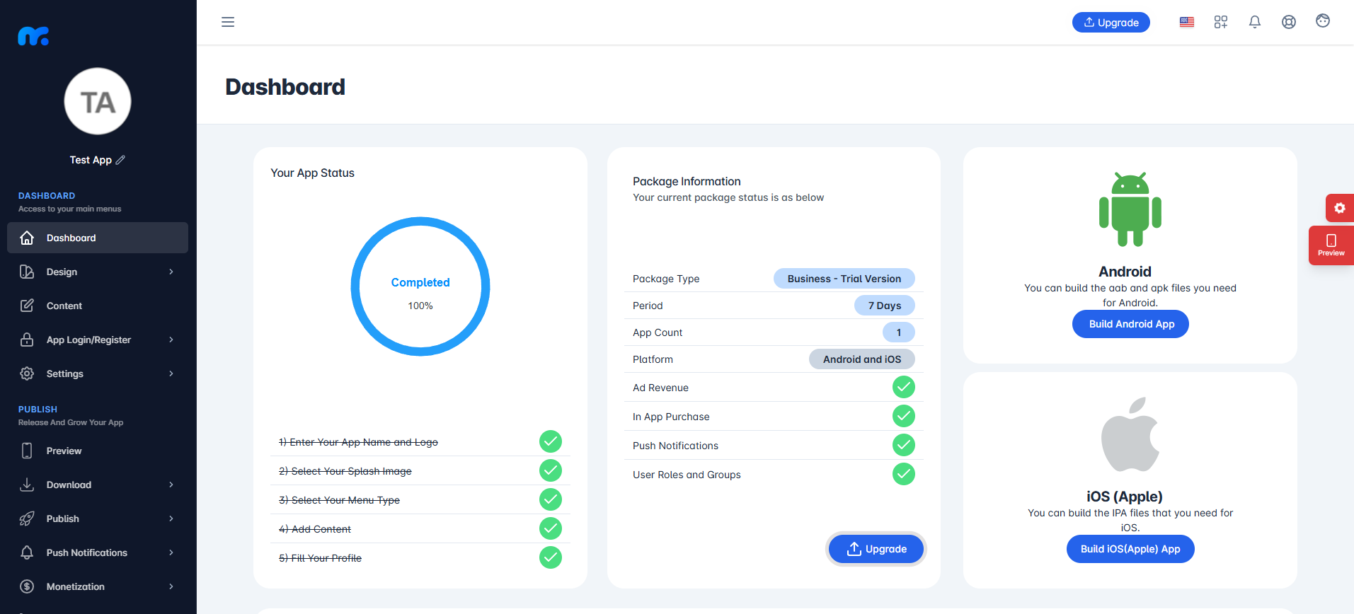
To change your app’s name or icon, click the pencil icon located at the top of the left-hand menu.
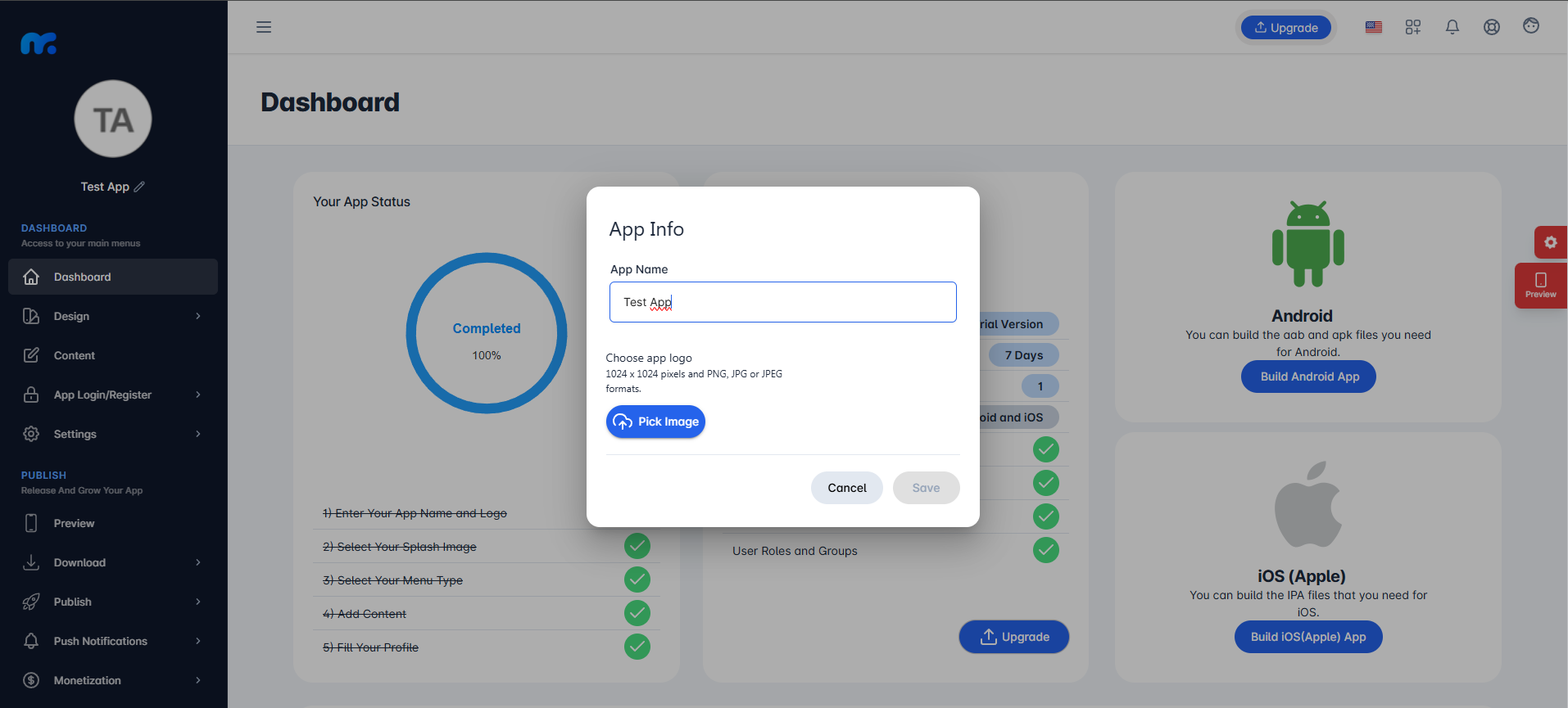
On the screen that appears, set the App Name (maximum 30 characters) and upload the App Icon in 1024×1024 pixel dimensions, using PNG, JPG, or JPEG format. Once done, click the Save button at the bottom right.
To apply the changes you made on the app information screen, you must generate a new APK and install this newly generated APK.
Our article explaining when you need to regenerate your APK will help you. Click here to read the article.
2.Design
You can customize your mobile app’s design from the Design tab located on the left side of your panel.
a.App Name & Icon
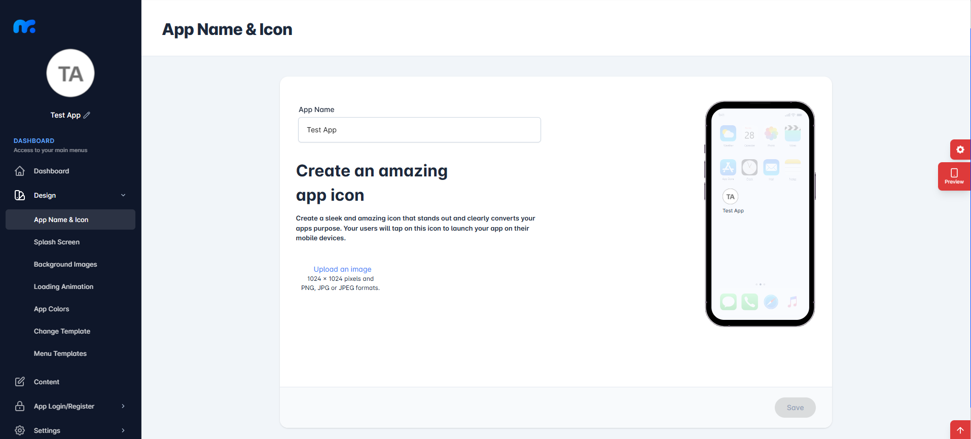
In this section, just like in part 1 of the article, you can change your app’s name and icon. Both sections serve the same purpose. You can use either of them to update your app name and icon as you prefer.
You can change your app’s name from the App Name section and click on Upload an image to select your app icon. When uploading an image, make sure it is in the required formats (PNG, JPG, or JPEG) and has dimensions of 1024×1024 pixels.
After making the necessary adjustments, click the Save button.
You can use the preview screen on the right side to see how the feature you’ve added will look in your app.
b.Splash Screen
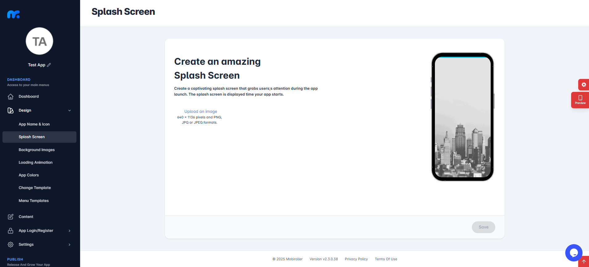
In this section, you can change the splash screen that will be displayed when your app is launched.
Click on the Upload an image section to add your own image. When uploading, make sure your image meets the required format and size specifications.
After making the necessary adjustments, click the Save button.
Using the preview screen on the right side, you can see a preview of the feature you have added to your application.
c.Background Images
This section consists of two parts:
- c1.Default background image
- c2.List Item Background
c1.Default Background Image
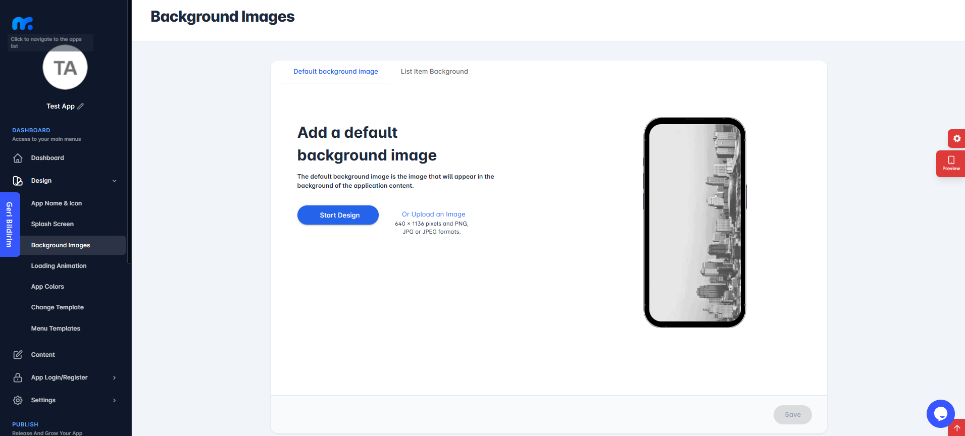
In this section, you can change the background image of your app.
Click on Start Design to choose from ready-made images available in Mobiroller’s library. Or, you can click on Or Upload an Image to add your own custom background.
Please ensure that the image you upload complies with the specified format requirements.
Once you’ve completed the necessary adjustments, click the Save button.
You can preview the feature you’ve added using the preview screen on the right side.
c2.List Item Background
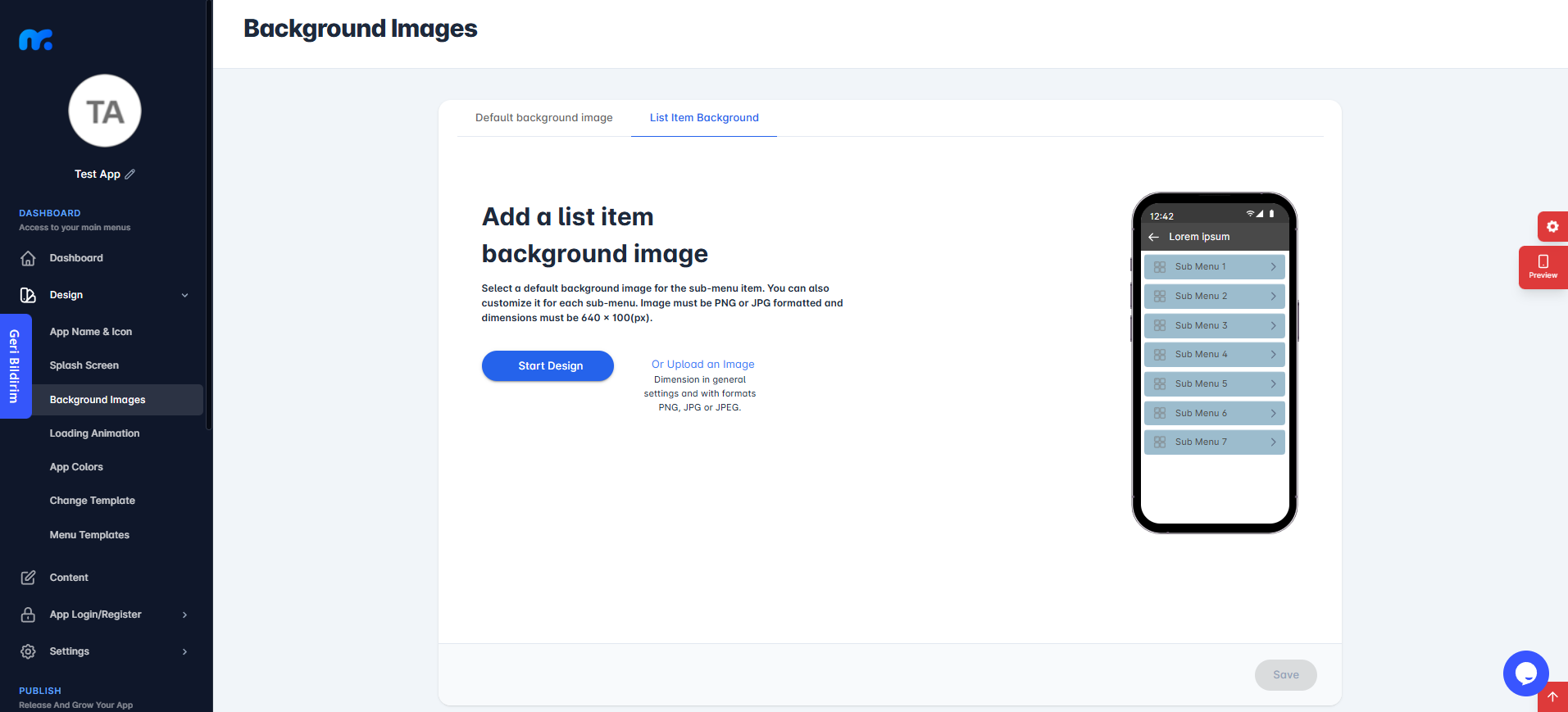
In this section, you can select a default background image for the bottom menu item.
Click on Start Design to choose from ready-made images available in Mobiroller’s library. Alternatively, click on Or Upload an Image to add your own custom background.
Make sure the image you upload complies with the specified format requirements.
Once you’ve completed the necessary adjustments, click the Save button.
You can preview the feature you’ve added using the preview screen on the right side.
Additionally, you can customize this background for each sub-menu individually by going to the Content section and editing the related Bottom Menu module.
d.Loading Animation
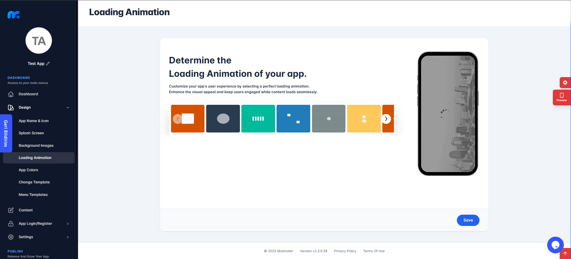
In this section, you can select one of the available loading animations designed for your app.
Once you’ve completed the necessary adjustments, click the Save button.
You can preview the feature you’ve added using the preview screen on the right side.
e.App Colors
This section consists of four parts:
- e1.Navigation Bar Color
- e2.Text Color
- e3.List Item Text Color
- e4.Loading Animation Color
In this section, you can configure the color settings for the relevant areas.
You can also preview the adjustments you’ve made using the preview screen on the right side.
e1.Navigation Bar Color
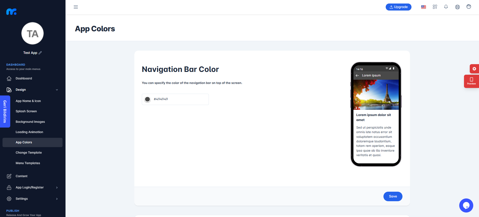
In this section, you can specify the color of the navigation bar located at the top of the screen.
Once you’ve made the necessary adjustments, click the Save button to apply the changes.
e2.Text Color
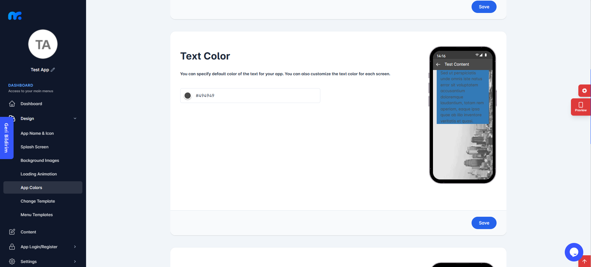
In this section, you can define the default text color for your application.
After making the necessary adjustments, click the Save button to apply the changes.
e3.List Item Text Color
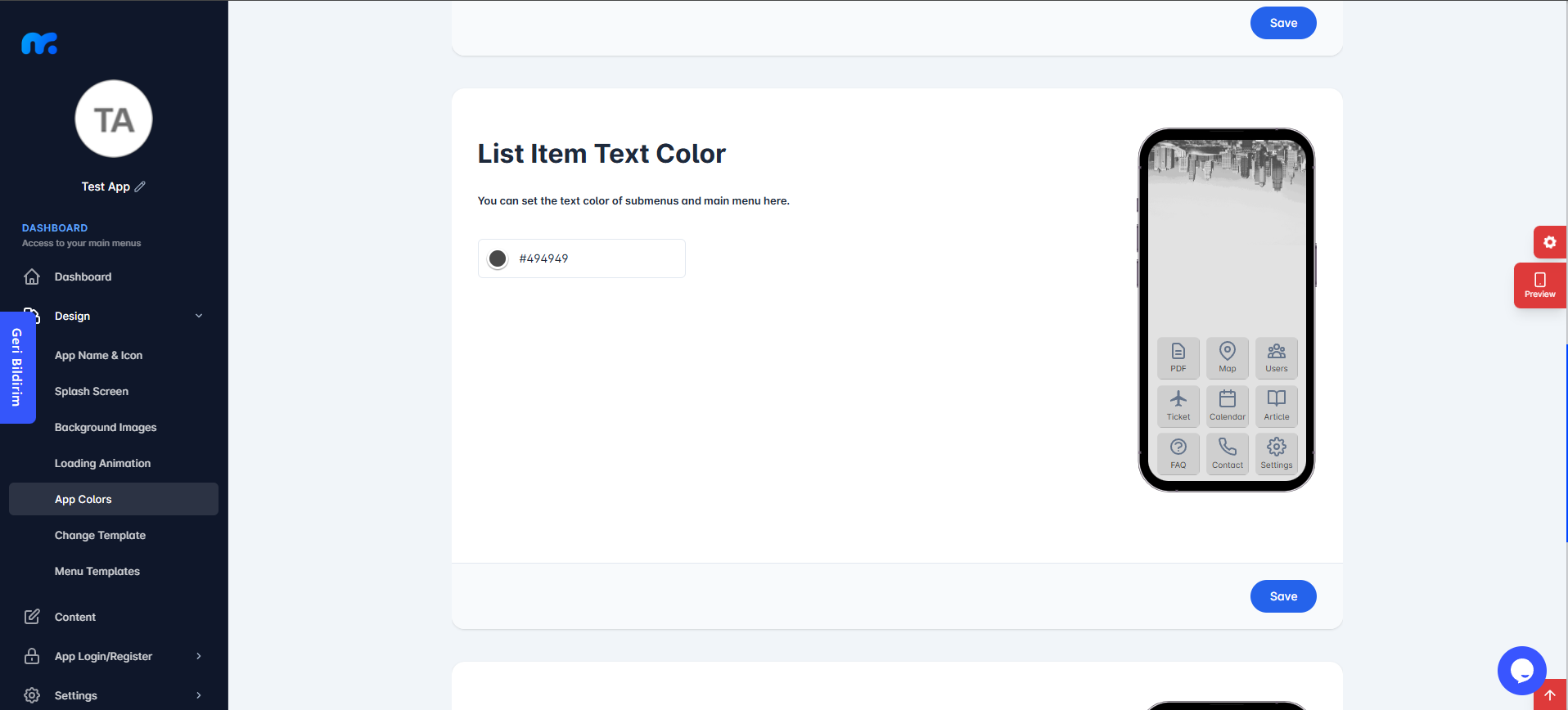
In this section, you can set the text color for the bottom menu.
After completing the necessary adjustments, click the Save button to apply the changes.
e4.Loading Animation Color

In this section, you can set the color of the loading animation.
After completing the necessary adjustments, click the Save button to apply the changes.
f.Change Template
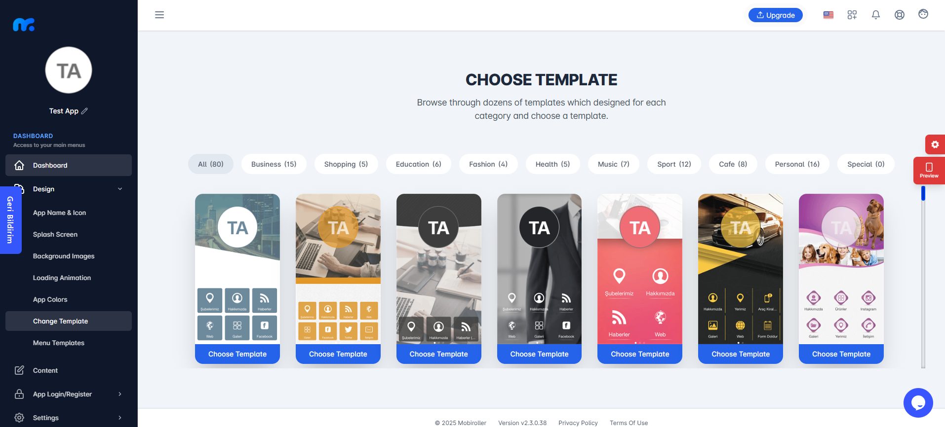
You can use the Change Template feature to modify the appearance of your mobile application.
On the screen that appears, you’ll see categories and template designs. You can either browse templates by selecting specific categories or scroll down to view all available templates.
Templates do not impose limitations. You can freely change the visuals and icon images displayed.
When you hover over the template you like, click the Choose Template button to activate it.
Once you click Choose Template, confirm your choice by clicking the Yes button on the screen that appears.
g.Menu Templates
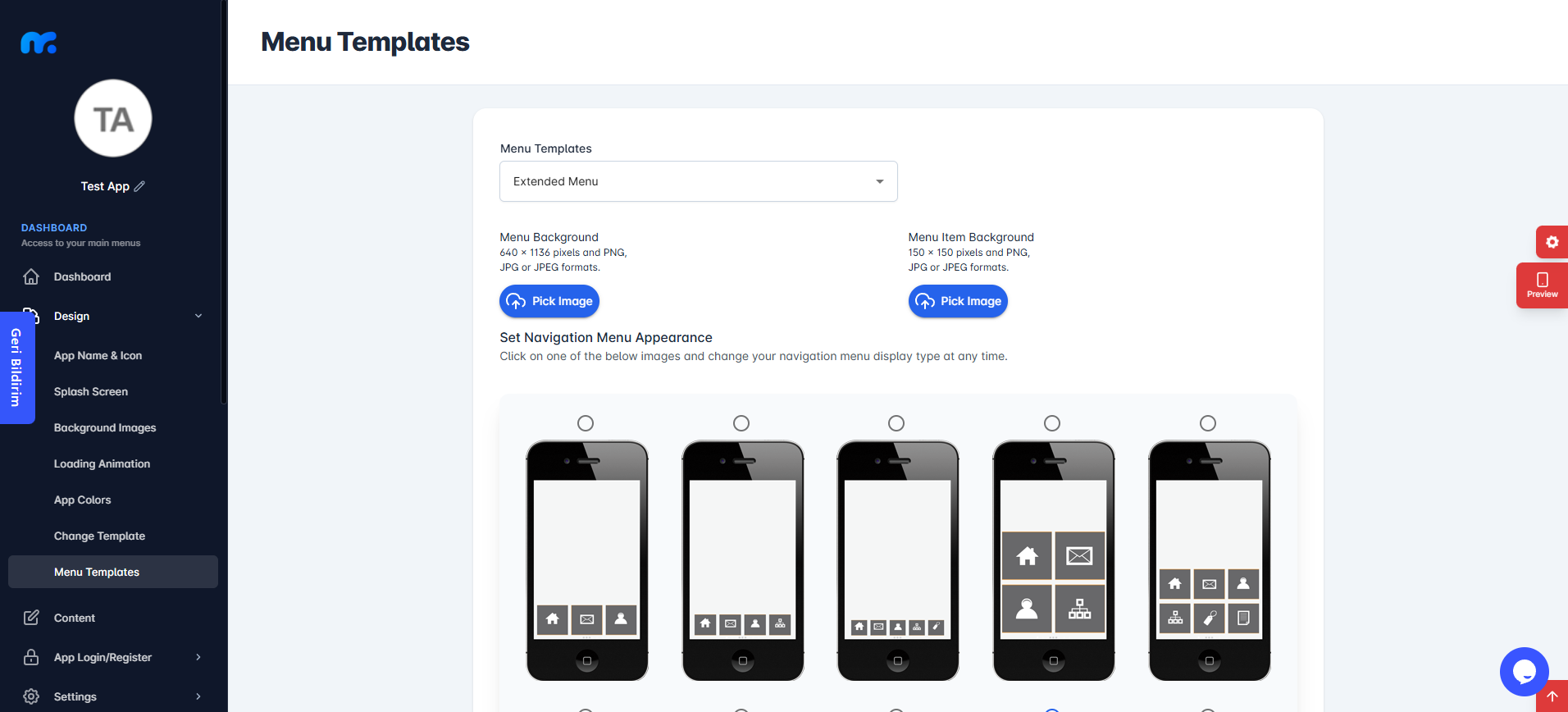
In this section, you can customize the menu templates that will be applied to your application.
By clicking on the dropdown menu under Menu Templates, you can select the most suitable template type for your app from the following options:
- Classic Menu
- Extended Menu
- Sliding Menu
- List Menu
- Top Sliding Menu
Choose the one that best fits your app’s design and navigation needs.
You can review how the templates will look by using the preview screens below. This will help you make the best choice for your app based on its design and functionality.
To choose an image for your menu background, click on the Pick Image button under the Menu Background section on the left.
Once you click the Pick Image button, you can upload your own image by selecting it in the Custom Image section. Be sure the image format matches the specified requirements.
Alternatively, you can click on the Library section to select from the pre-made images provided by Mobiroller’s library.
Click the Pick Image button under the Menu Item Background section on the right to choose an image for the background of the menu items. This section allows you to adjust the background of the cells within the menu.
Once you click the Pick Image button, you can upload your own image by selecting it in the Custom Image section. Make sure the image format complies with the specified requirements.
Alternatively, you can click on the Library section to choose from the pre-made images available in Mobiroller’s library.
After making the necessary adjustments, click the Save button.
3.Module Design
This screen may vary across different modules. For detailed setup instructions for each module, please refer to the Modules page.
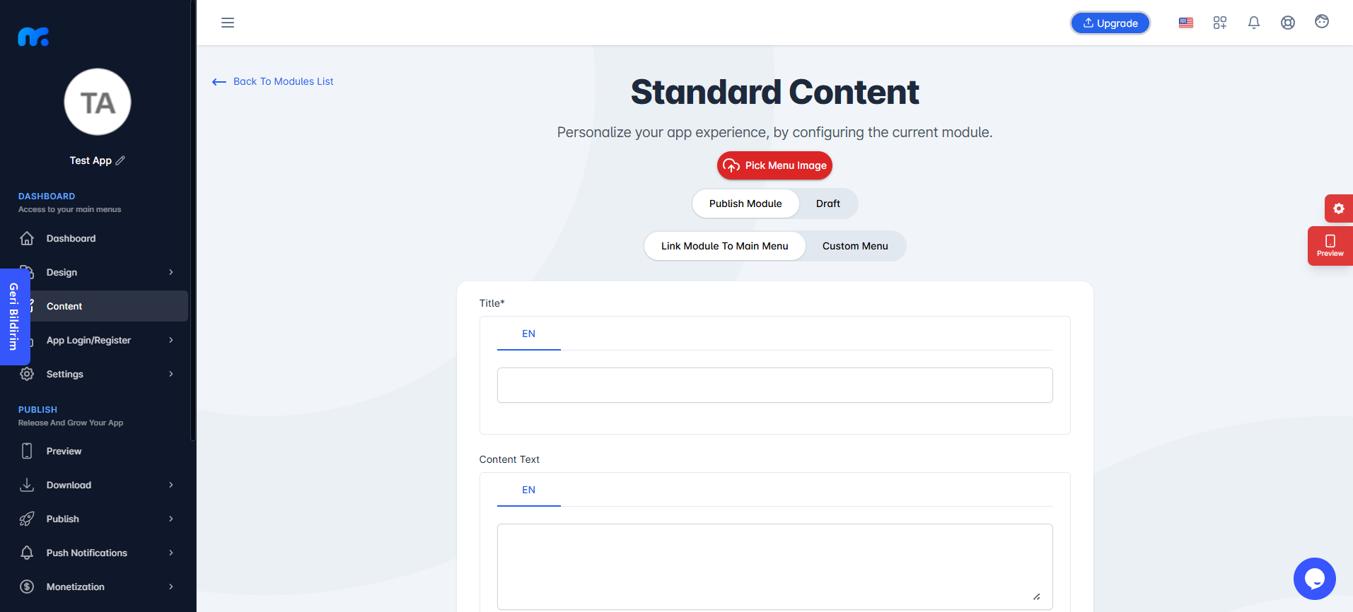
You can customize the app icon for each module. To do this, click the Pick Menu Image button located below the standard content section.
When the image selection screen opens, you can upload your own image by using the Custom Image field.
Make sure your image meets the required format specifications.
Alternatively, you can click on the Library section to choose from a collection of ready-to-use images prepared by Mobiroller.
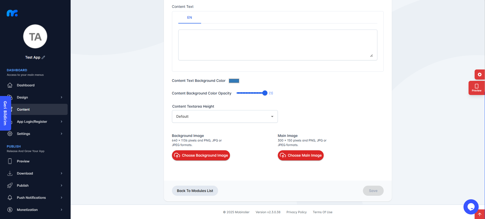
Background Image: In this section, you can upload a background image specific to this module.
If you choose the default option, the image set under Design > Background Images > Default Background Image will be used.
Main Image: The image you upload here (300×150 pixels) will appear at the top of the content area within the module.
After making the necessary changes, be sure to click the Save button.
After customizing your design, you can preview your app by checking out the article Step 4: Preview Your App.